Greetings Instructors!
The New VoiceThread is here! VoiceThread, an interactive presentation tool, has a sleek new look and some useful new features. On Wednesday, October 1st, the new VoiceThread will be enabled for A&M-Commerce. Accessing VoiceThread through your online course shell by clicking on the VoiceThread Course Item will remain the same.
We’ve compiled several resources to help you get to know the new VoiceThread better. Full documentation of the upgrades can be found at VoiceThread Support. Additionally, tutorials on how to Create a VoiceThread or to Share a VoiceThread can also be viewed.
There is also a brief overview of the changes in the new VoiceThread below with screen shots, so you can see exactly what is new. The new VoiceThread works well in all modern web browsers.
Please Note: If you have any embedded (not linked) VoiceThreads, once the new VoiceThread is enabled on Wednesday, October 1st, you will need to re-embed them using the new embed code associated with your VoiceThread.
A session, hosted by the Center for Faculty Excellence & Innovation on November 17th, 2014 from 2 p.m.-4 p.m., will feature a webinar lead by a VoiceThread expert and a question-and-answer period to help you make VoiceThread more relevant to your needs.
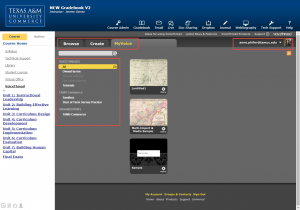
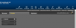
The old VoiceThread looked like this when you opened the MyVoice tab from the eCollege Course Item:
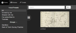
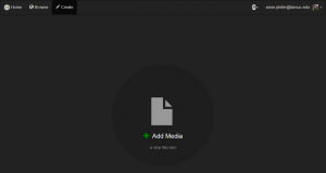
VoiceThread’s landing page now looks like this:
As you can see, the “MyVoice” tab has been replaced, and the side menu is now hidden. When you hover over the sidebar item with three lines, you gain access to the side menu.
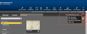
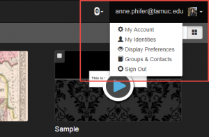
The Account drop down is essentially the same from the old look to the new look:
Old Look
New Look
New display preferences make it easier to view VoiceThread in a way that is comfortable for the individual working with the software.
In the old style, VoiceThread creation was done in the Create tab by uploading, and then adding new bits of media after the fact, if necessary.
The new VoiceThread has a simple area where you can either choose files in the same way you did before, or drag and drop a collection of files all at the same time.
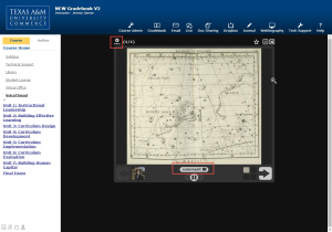
The comment functions are all the same from the old look to the new look. Users are still capable of making comments by text, microphone, telephone, or webcam. The only change is the comment button itself.
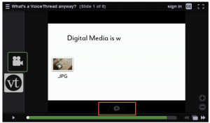
Instead of a button that says “Comment,” VoiceThread now employs a simple word bubble icon.
As always, clicking the comment button will open up a menu that shows users the variety of ways they can make comments on a VoiceThread.
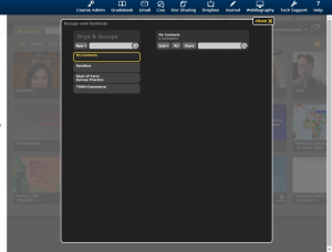
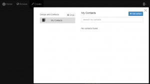
Group set up works the same way in both versions of VoiceThread as well.
The new look is set up the exact same way, but has a cleaner looking interface.
The new VoiceThread operates almost exactly like the old VoiceThread did. It’s still the same great presentation software, but with more options and an updated look.


Recent Comments